If you were a ‘90s kid, then you’ve probably had a childhood filled with Trolls, Polly Pockets and afterschool viewings of Sabrina the Teenage Witch, sipping on a Capri Sun.
And if you weren’t a ’90s kid, then you’ll probably wish you were. The era was filled with vibrance and colour, and some of the most iconic logos from this decade are a reflection of this.
There’s a reason that the trends from the ‘90s keep resurging, and that’s simply because they were too good to leave in the past! Fancy reminiscing about some influential logo design from the ‘90s that are going to hit you with some serious nostalgia? Then, read on!
Blockbuster
We’re sorry to reopen the wound, but this iconic store was a big part of any ‘90s kids’ childhood, and was effectively the land-based predecessor of Netflix. Back in the day, if you wanted a movie night you didn’t launch a streaming platform and scroll through your options, you physically left the house, went to Blockbuster and browsed through the videos on the shelves, until you found a gem that took your fancy. You’d then either buy the video or take it home on a rental agreement, and then have to return it in a few days.
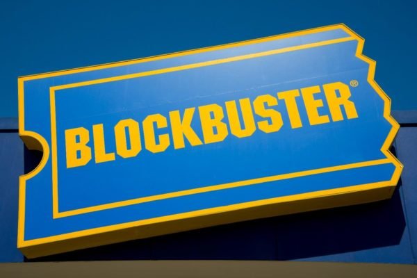
Now, if that doesn’t bring memories of your childhood flooding back, then the logo probably will. Aptly shaped like a cinema ticket and coloured in royal blue and gold, the Blockbuster logo was simple, yet memorable. Unfortunately, the film rental company went bust in 2013 and the world turned to online streaming platforms for their movie fix.
It could be argued that Blockbuster’s simple, but simple is actually one of the keys to good logo design. Another simple logo, utilising two colours and whose name is written in bold and capitalised, much like its ‘90s precursor.
Hot Wheels
We swear that 80% of the time that we spent watching TV as a kid was taken up sitting through adverts showing the latest toys that we’d probably add to our Christmas lists. One such advert was for Hot Wheels, and there are few logos as hot as this fiery number. Founded by Mattel, Hot Wheelswere the coolest and most daring model cars on the market and their logo was a reflection of this, featuring a waved flame design, with a red, yellow and white colour scheme. Hot Wheels really weren’t your standard model car, as you could buy ramps and tracks, that would probably see you firing your cars at your siblings, causing your parents grief, but giving you hours of entertainment.
Hubba Bubba
As an adult, you’ve probably outgrown your craving for a chewy sweet substance that you can blow into bubbles, but as a ‘90s kid, Hubba Bubbawas where it was at. As far as afterschool sweets went, Hubba Bubba was up there with Toxic Wasteand Rainbow Drops, it was an elite tier choice.
The logo was bright and punchy, with the name being animated in bright yellow bubble font with a bold purple background. Believe it or not, the logo represented the brand so well that they haven’t strayed from this ‘90s design today. So, should you ever fancy jaw ache and bubble blowing competitions, you’ll be able to recognise this old ‘90s favourite.
But hey, if you fancy returning to your ‘90s roots to unleash your inner big kid, check out this new creation from M&Ms!
What do you reckon – have we missed any other iconic ‘90s logos? Let us know in the comments below and let your nostalgia run wild.